Activity Analysis popup
The Activity Analysis Pop up (Click on the activity in calendar view or in an activity list) top menu includes these items:
THESE ITEMS SHOULD BE CHECKED AND UPDATED AS PART OF YOUR ACTIVITY REVIEW PROCESS.
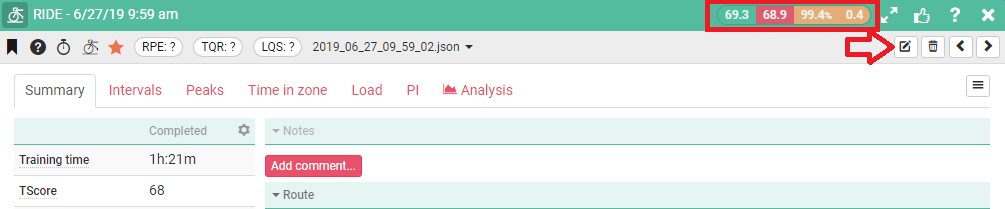
Sport, Date and Time
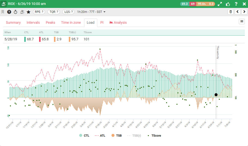
Color icons: CTL (On this Day), ATL (On this Day), TSB %, TSB Value.
Next to that are in order (left to right): Open activity analysis view. Leave feedback, Help and close.
Below that on the right hand side (Arrowed): Edit activity, Delete activity, Previous Activity, Next Activity.
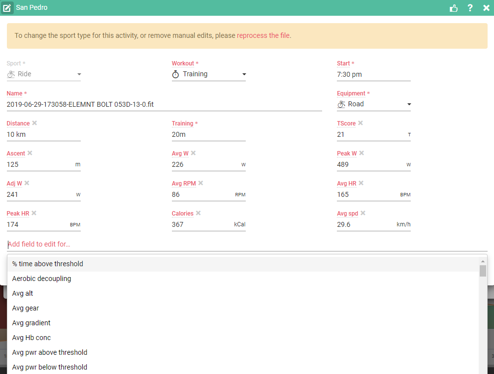
Edit Activity opens a popup that lets you make manual changes to the data related to this activity
The line below this has the following menu items (Left to right)
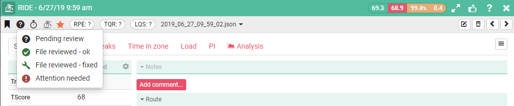
Bookmark Favorite: Mark this activity as a favorite so it can easily be found in filtered views.
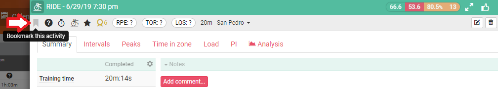
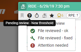
Review Status: The default is pending review, you can change this to file reviewed – OK, or Reviewed and Errors fixed this means you have “Signed off” on the activity. You can also mark it as attention needed so you can come back and fix it later.
Pending Review - TOP FEATURE
It’s really important to review every activity you complete to ensure the data is collected correctly and has no anomalies. You also need to check your execution against plan.
When you are training every day and especially if you’re not a pro it’s really easy to end up with a backlog of un-reviewed activities, after a week or so you’ll become disconnected, won’t remember the activity and won’t be able to complete the subjective notes.
As a reminder all activities are marked by default as “Not Reviewed” and you can filter activity lists to show activities you haven’t reviewed. Once you’ve updated the activity you can mark it as reviewed.
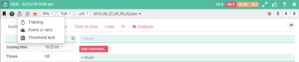
Activity Type: Set the activity type: Training, Race, Threshold test- Default is training
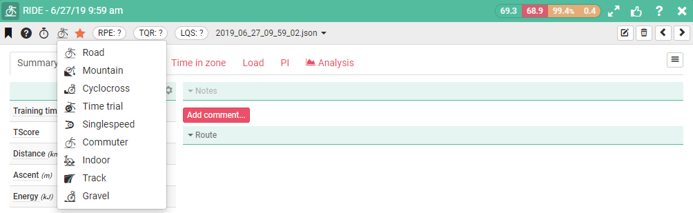
Sport: Set the sport type for this activity
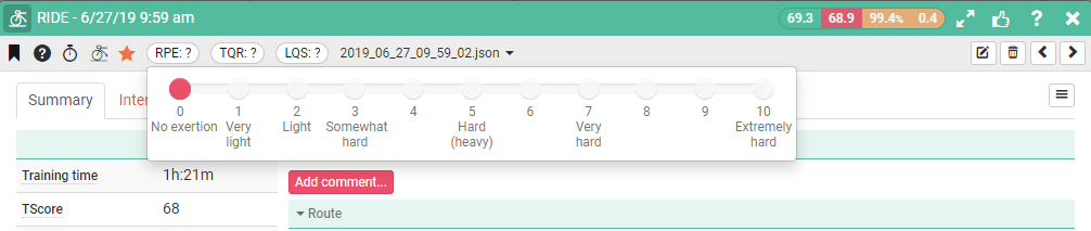
RPE (Rate Perceived Effort): Radio button to set RPE
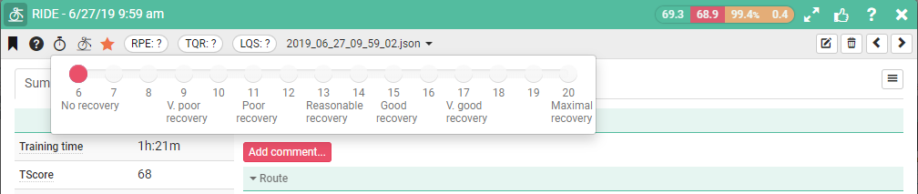
TQR (Total Quality Recovery): Radio button to set TQR
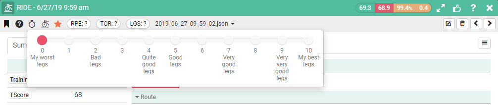
LQS (Leg Quality Score) : Radio button to set LQS
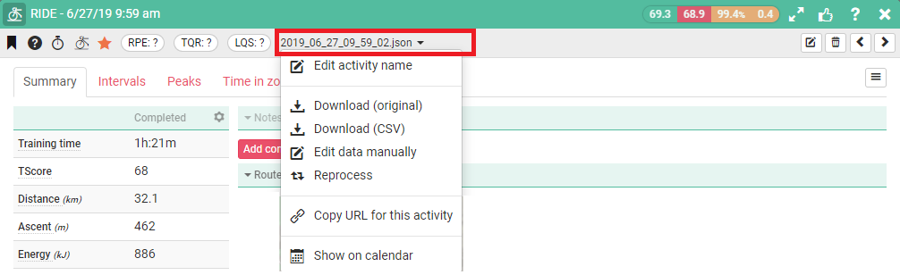
File name/Type and actions: What is the file type for this activity, also offers some file and activity management options.
Activity Analysis Tabs
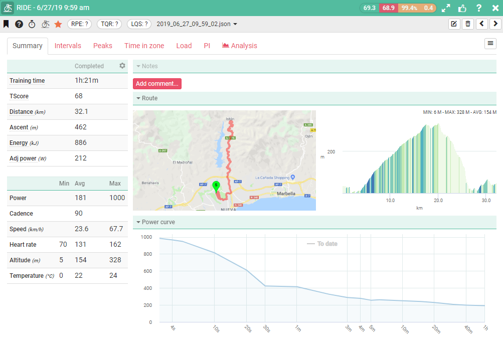
Summary: All your activity KPIs at a glance.
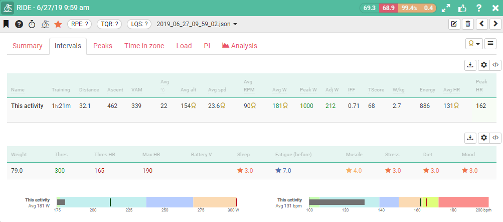
Intervals: KPIs by interval versus the Entire activity.
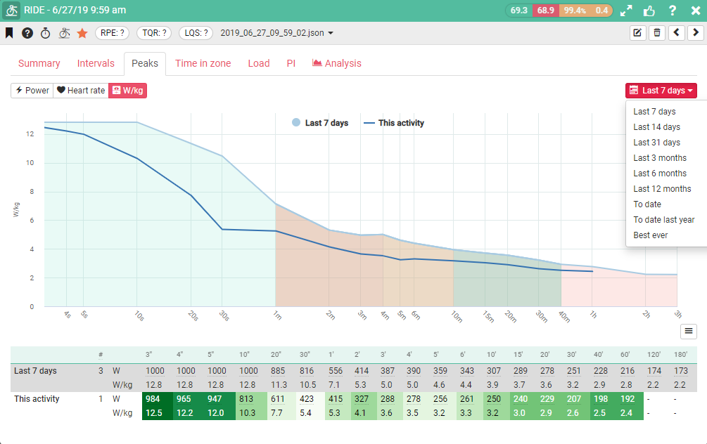
Peaks: Peak total power, power W/Kg, Heart Rate this activity versus time period selected from dropdown top right.
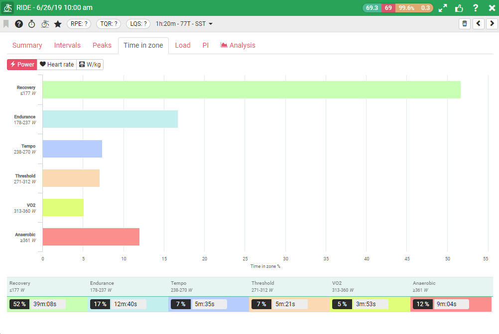
Time in Zone: Time spent in each Zone for Power Total, Power W/Kg and Heart Rate
Load: Your Performance management chart.
PI: Your performance Index Ratio for this activity versus your best ever.
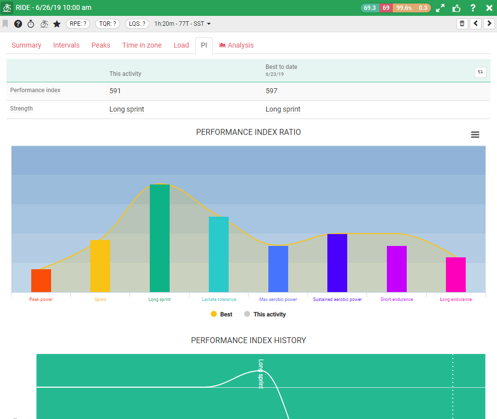
Performance index “buckets” are as follows:
Peak Power
If you are strong here you have exceptional maximum power. You have great acceleration and can win the final sprint.
Sprint
If you are strong in your sprint you can perform well when it comes to a bunch finish. You are a short to medium length sprinter and wait until late in the race to launch your run to the finish line.
Long Sprint
If you are strong in the long sprint you can hold a high power for the attack from a little further out, bridge a gap to a breakaway or be the final lead out athlete in your teams train.
Lactate Threshold
If you have a good lactate tolerance you are going to be strong in short sharp punchy terrain. You can pull great short turns or launch a late opportunistic attack to beat home the peleton.
Max Aerobic Power
If you are strong in your maximum aerobic power you are going to be great in short pursuit type scenarios like establishing a breakaway or pushing the pace on short to medium length uphill finishes.
Sustained Aerobic Power
If you have a great sustained aerobic power you will be a great driver of the pack. Get on the front and put the peleton in the gutter to wear the others down with some long runs.
Short Endurance
If you are strong here you will have good endurance and can sit on the front of the bunch setting a tempo and control the race or drive it on the flats or bring back a breakaway.
Long Endurance
If you are strong in your long endurance you will be able to hold a high sustainable power for a long time. You may be a great time-trial athlete and once you settle into your pace others will struggle to hold your wheel.
Analysis: This is the main analysis overview area for this activity.
Analysis Sub Menu
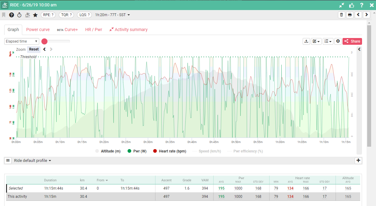
Graph (Activity Chart)
Graph (Activity Chart) configuration options
To configure this chart click on the settings icon (arrowed).
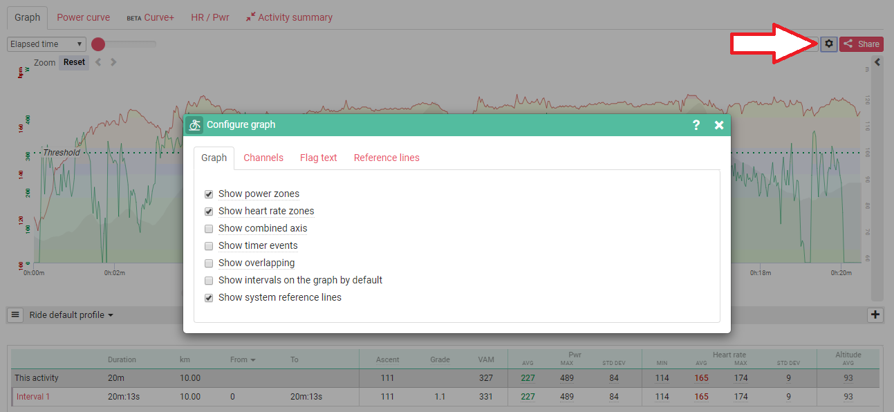
There are four tabs:
General: This includes the display of zone colors, adjusting the axis scaling and more.
Channels: You can set which channels are displayed by default, add rolling averages, and adjust the way in which the channels are displayed (colors, style, etc). This will also adjust the fields that are displayed in the summary view to the right of your graph.
Intervals/peaks: This lets you adjust the fields you see when looking at your intervals on the graph. You can also select whether to see or hide interval details when displayed on the graph.
Reference lines: You can save preset reference lines that will appear every time you open a new file. An athlete’s threshold will already appear but you can add more reference lines if you like.
The preferences above are unique to each sport type. When activity files are uploaded Today’s Plan can automatically detect the sport type and load different settings relevant to that sport.
Chart analysis tools
Next to the graph settings icon is the peaks and intervals details button (arrowed). This again uses the sport type to determine what fields to display and can include; intervals and peaks details for power, heart rate, pace, leg spring stiffness and leg spring stiffness/kilogram.
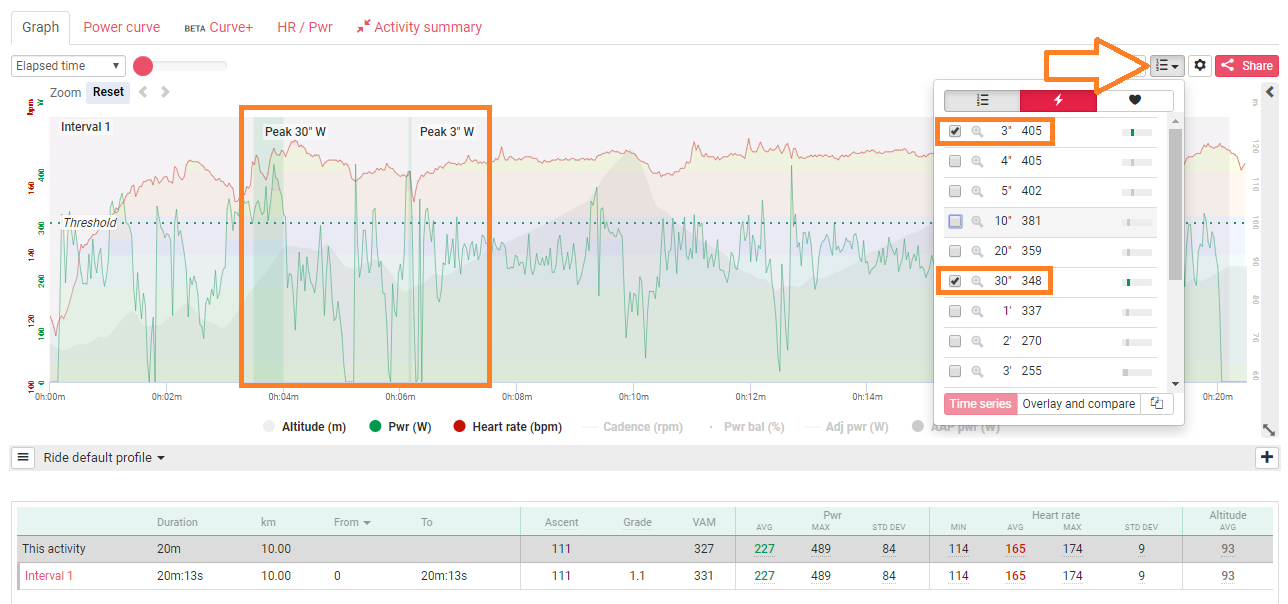
You can use the tick boxes to display a certain field such as where a peak power occurred in a ride, or the magnifying glass to zoom into that particular section.
At the top of the dropdown are buttons to select Power or Heart Rate intervals.
The details of that section will also be displayed in the summary bar on the right of the activity graph.
From this same drop down you can also overlay other files (coaches can overlay files between different riders too).
To the left of the Intervals button is the Data Editing button to help eliminate erroneous data or replace certain areas of a file. If it’s a .fit file you will also see an option to split your file, for example you could split a file into three: warm up, race, cool down.
Finally, in the top left of your activity graph you have smoothing options for your data and you can adjust the scale in which you are viewing your data. These options include, elapsed time, elapsed distance and time of day.
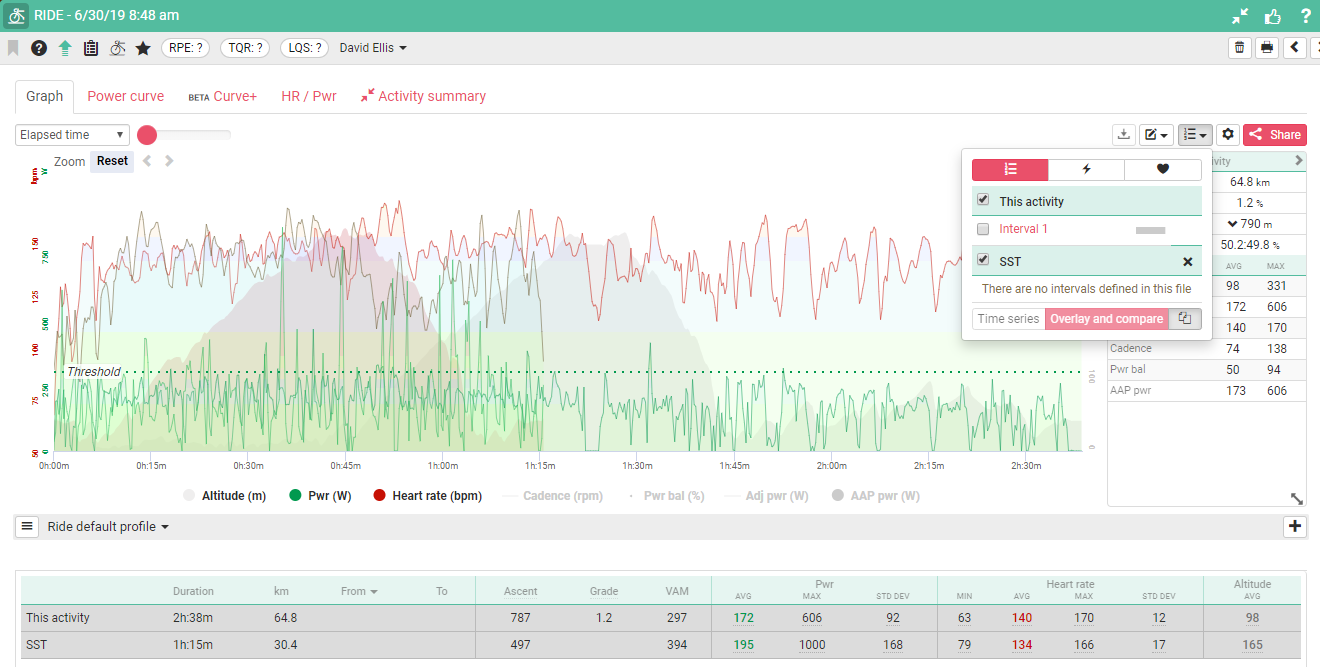
Overlaying and comparing activities
One of the best features of Today’s Plan ‘activity summary’ window is that athletes and coaches can overlay up to five workouts or race files on the same screen,
This lets you compare workouts of similar structure and execution, look for improvements, or use it to break down your racing performance. If there aren’t improvements, then the training plan needs to be reviewed and modified.
Coaches can also overlay files from other athletes, Letting them see how different athletes react to the same workout. Athletes often respond differently depending on their physiology and their strengths and weaknesses.
Another way to use this feature is to overlay your race data with your training data to see how closely your training rides match you race rides
Note: If you don’t have a coaching account and want to overlay your own rides, ask support to activate this feature for you.
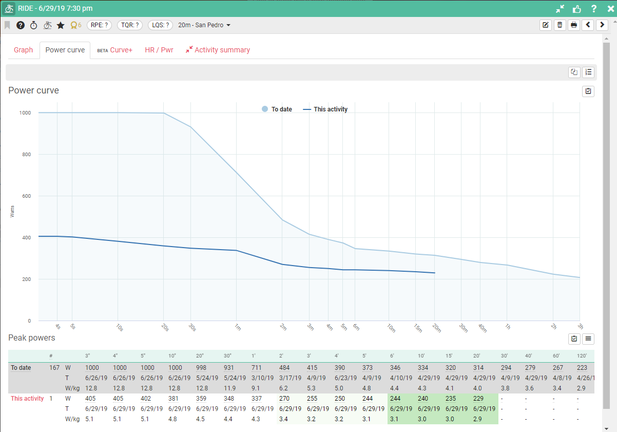
Power Curve: This shows your all time peak power per time period versus the values for this activity.
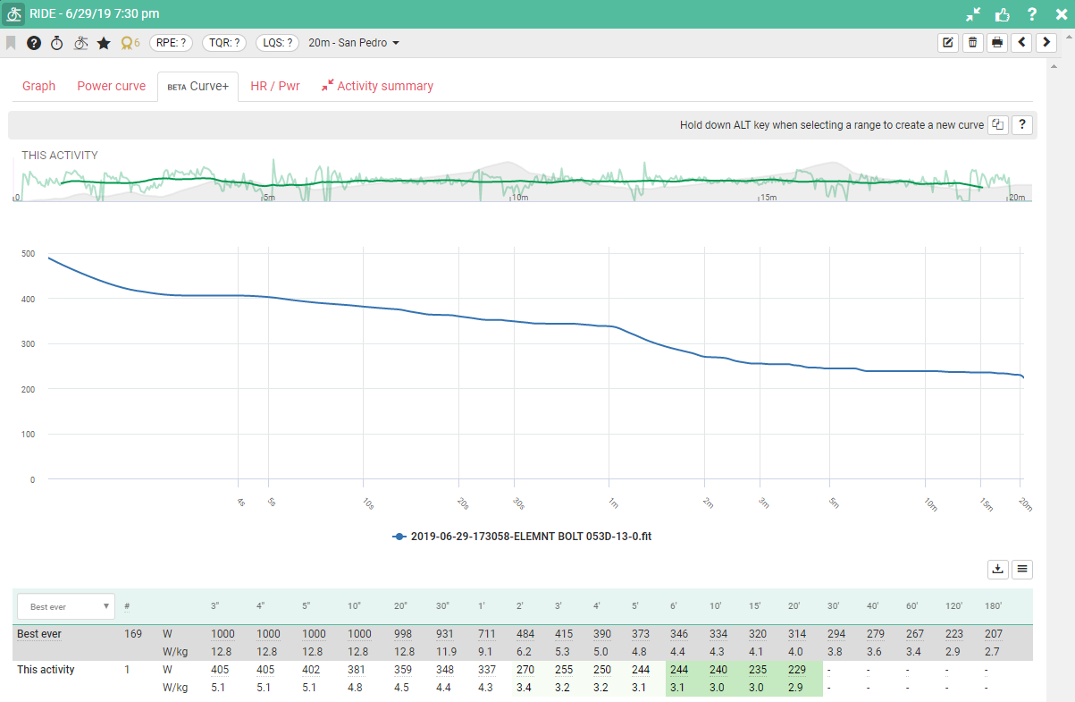
Curve+: Detailed breakdown of this activity power curve including table with heatmap showing performance of that power segment again best ever.
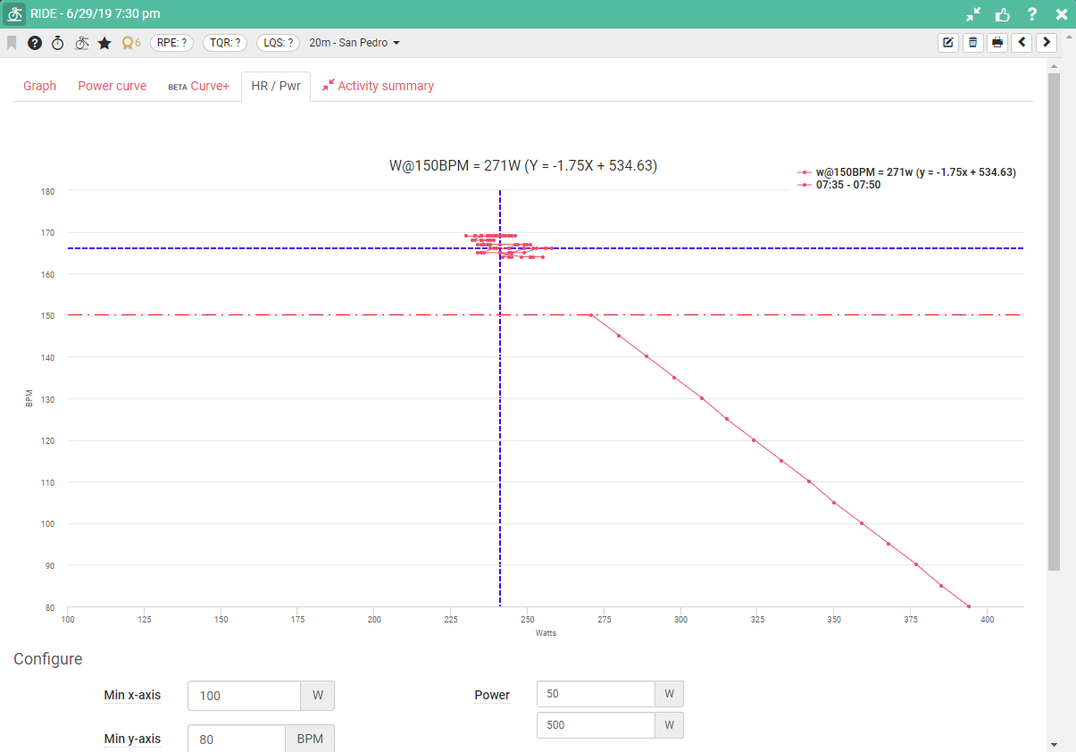
HR/Pwr: Scatter chart showing Heart Rate versus Power.
Activity Summary: returns you to the activity summary page
