
Main Analysis Menu – Activities
The default view shows a list of activities. At the bottom of the Left sidebar are three icons that let you toggle between also showing/not showing the calendar and intervals sections. Hovering over an interval shows interval details. Right clicking on an interval lets you create a performance test and create a route segment. You can also zoom out or zoom to interval
Clicking on the hamburger menu top right of the interval section lets you find intervals based on selectable criteria.
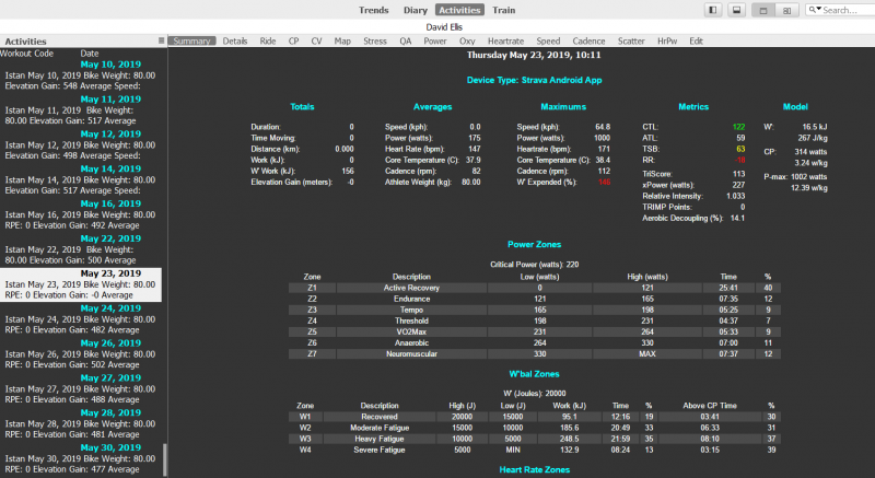
Activities > Summary
Summary of most commonly used metrics by activity.
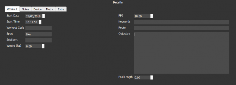
Activities > Details
Section to manually diarize activity details, there are four tabs:
Activities > Details > Workout
This section lets you record RPE, Objectives, route and more. It’s possible to enter a weight value here that overrides the athlete default values for this activity only.
Activities > Details > Notes
A full page editor for adding detailed notes about this activity.
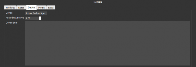
Activities > Details > Device
Details of device used to record selected activity.
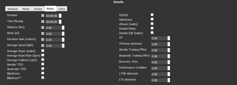
Activities > Details > Metric
The 'Metric' tab is pre-populated with a number of metrics (as defined in Options > Data Fields .
To enter or overwrite a 'Metric' value, check the box next to the metric to open the input field for this metric. Only if you then input a value different to '0', this value will be taken as the metric value for this activity (and overwrite any value coming from your activity data).
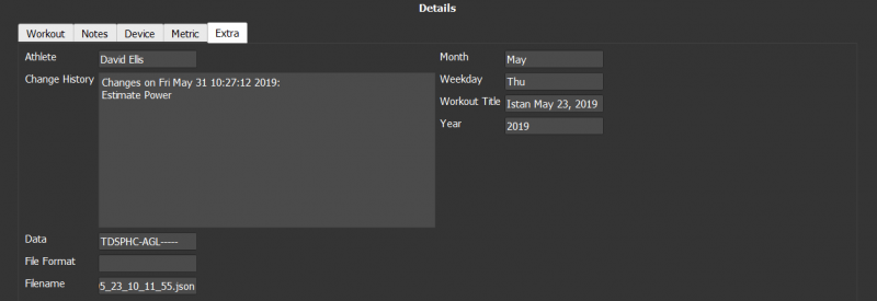
Activities > Details > Extra
Activity change log and file location. The 'Extra' Tab is a set of 'Read Only' fields, which are automatically generated based on your configuration.
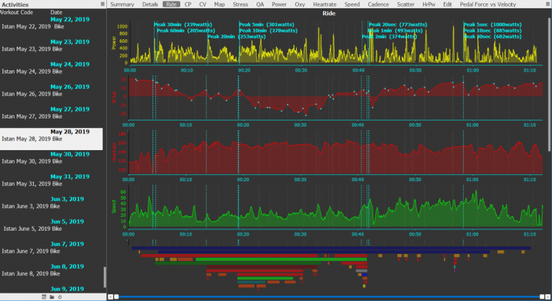
Activities > Ride
Chart View Options: Smooth, Stacked, By Series, Fullplot, Overlay
Multiple stacked metrics for the selected ride.
Deselecting "stack" in chart settings overlays metrics instead of stacking them like this.

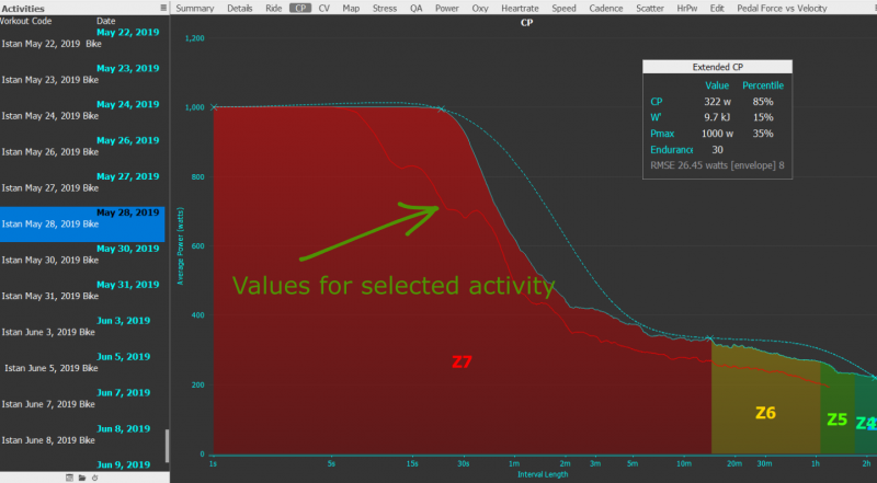
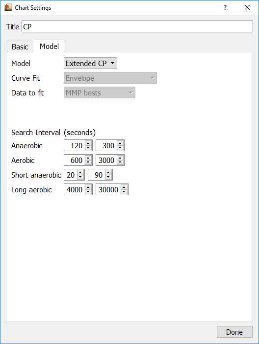
Activities > CP
Chart View Options: Percentage of Best, Show Heat.
Golden Cheetah refers to FTP as Critical Power (CP).
CP (Critical Power): Power that can theoretically be maintained for an indefinitely long time without fatigue.
FTP (Functional Threshold Power): The highest power that a rider can maintain in a quasi-steady state without fatiguing for approximately one hour.
In practice, CP and FTP are usually close to each other. But since it is very difficult for an athlete to maintain the desired intensity FTP 'reality' tends to result in a number that is much lower than CP 'theory'. Often users will consider the two as the same.
Golden Cheetah computes TSS and BikeScore using your 'CP' value, but from v3.3 you can maintain separate values for CP and FTP in the athlete power zones settings. If you do that, the 'Coggan' metrics will use FTP and not CP to calculate.
Golden Cheetah puts all the data from your rides together and estimates your FTP and as you get fitter it adjusts accordingly. Basically you need to do a little bit of everything (threshold riding, tempo, endurance, VO2 max) and the software connects all the dots to give you a number.
There are three curves in the chart.
- Dotted line is the model of Power Bests
- Filled Rainbow Chart is the actual power best for all activities
- Red line is the power values for the selected activity
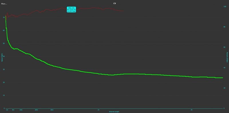
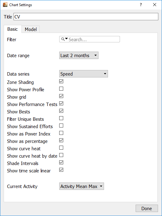
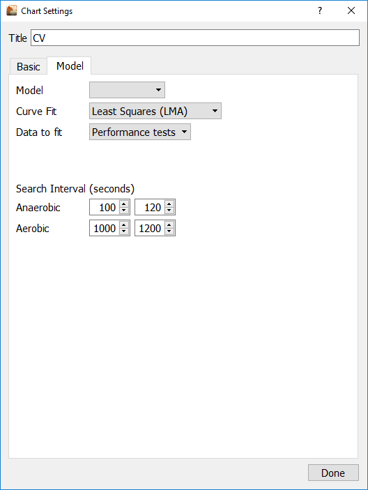
Activities > CV
Chart View Options: Percentage of Best, Show Heat
The equivalent of CP chart but modeling speed-vs-duration (CV) instead of power-vs-duration (CP)
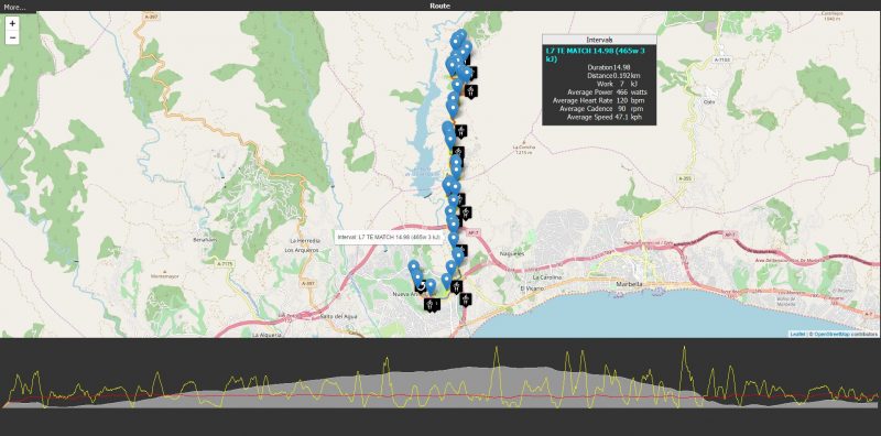
Activities > Map
Presents a map of your activity with intervals highlighted and key interval metrics displayed. Click on a map marker to add it to the Interval metric box click again to remove it
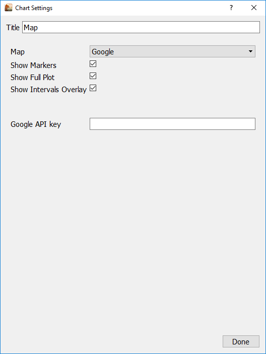
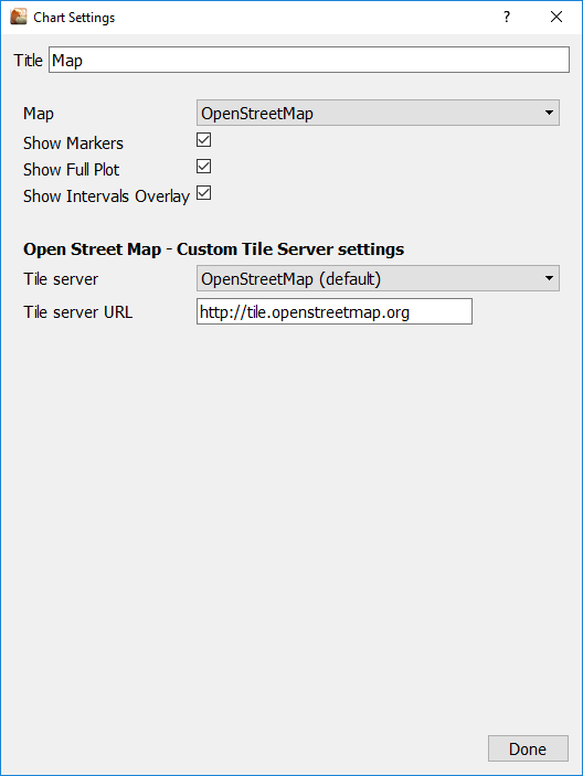
Click on more… chart settings to choose between Google Maps and Openstreetmap. Openstreet map works out of the box. To use Google you need to get an API (see Below)
How to get your Google Map API
Google charges for the API but also give you a free $200 USD monthly credit more than enough for a GC user!
See the Google maps API pricing table here https://cloud.google.com/maps-platform/pricing/sheet/
Here’s how to go ahead and get your API to enter into GC
- Visit the APIs Console at https://code.google.com/apis/consoleand log in with your Google Account.
- Click the Services link from the left-hand menu.
- Activate the Google Maps API v3 service.
- Click the API Access link from the left-hand menu. Your API key is available from the API Access page, in the Simple API Access section. Maps API applications use the Key for browser apps.
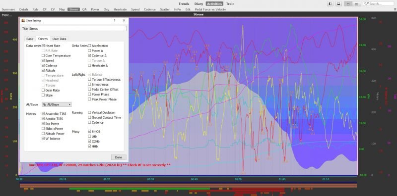
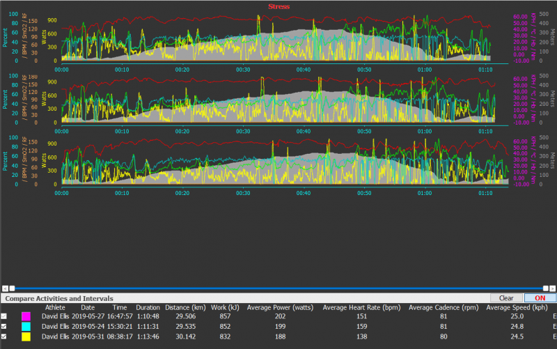
Activities > Stress
Chart View Options: Smooth, Stacked, By Series, Fullplot, Overlay.
Lets you plot various stress metrics for the selected activity, you can also compare activities.
Hover over axis labels to show only that curve.
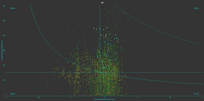
Activities > QA (Also Known as Pedal Force vs Pedal Velocity)
Chart View Options: Shade zones, frame intervals
The QA chart plots the relationship between pedal force on the Y axis and the pedal velocity on the X axis. It is divided into 4 Sectors or Quadrants, each one representing a key riding style as follows:
- Quadrant I (upper right): High cadence, high force. Sprint type work.
- Quadrant II (upper left): Low cadence, high force. Hill climbing work, Standing Starts.
- Quadrant III (lower left): Low cadence, low force. Easy pedalling, (in the pack or while resting between intervals).
- Quadrant IV (lower right): High cadence, low force. Fast pedalling with little resistance, (sitting in the middle of a pack or pedalling downhill.).
The percentages in each corner show the proportion of ride time spent in that quadrant
The larger Diamond shaped elements are the average values for each interval.
The red curved line shows the point at which pedal forces and pedal speeds combined, equal your Critical Power (CP – Which is entered in the chart settings)
The dotted red curved line shows the point at which pedal forces and pedal speeds combined, equal your Maximum Power (Pmax – Which is entered in the chart settings)
The Quadrant split is determined by the value you enter for RPM in the chart settings.
The Crank Length determines the correct values and scale for the X-Axis and is defaulted from the setting in Tools > Options > Athlete > About.
There Are Four Other Key Settings in Chart Settings:
Merge Intervals: if checked (and ‘Frame Interval’ is NOT checked) this shows the intervals selected in the ‘Side Bar’ but not the complete data points.
Frame Intervals: if checked – shows all data points – and highlights the intervals selected in the ‘Side Bar’.
Gear Ratio: Data points are colored according to gear ratio.
Shade Zones: if checked, the power zones Z1 – Z7 are shown these are a percentage of CP and are set in the default area of the power zones in Athlete options.
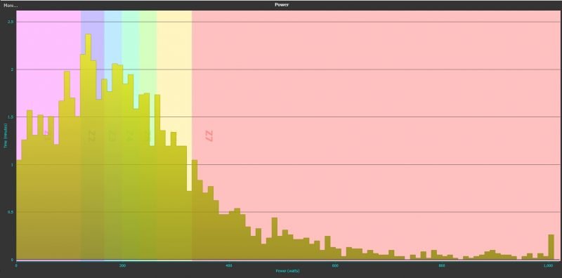
Activities > Power
Chart View Options: Bin Width, Shade Zones, Show in Zones
Shows your Power figures during the activity.
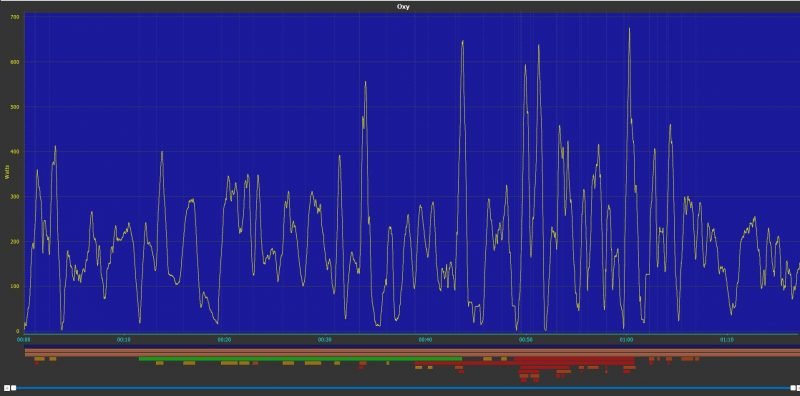
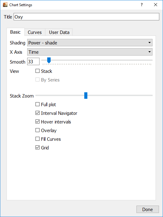
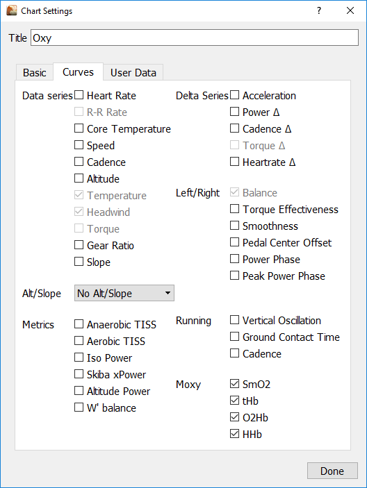
Activities > Oxy
Chart View Options: Smooth, Stacked, By Series, Fullplot, Overlay
This chart plots data from a Moxy Muscle Oxygen Monitor. https://www.moxymonitor.com/
Features include:
- Direct download from device
- Import CSV (moxy + peripedal) and FIT format
- Merge Tool changes
- Shift S+C to Smo2/tHB
- Derive HHb and O2Hb from SmO2/tHb
- Chartride, 2d, 3d, histogram
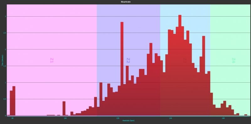
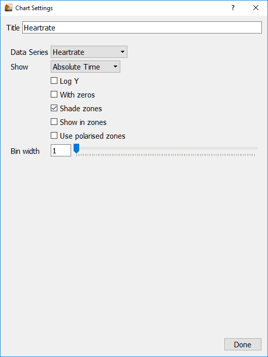
Activities > Heartrate
Chart View Options: Bin Width, Shade Zones, Show in Zones
Shows your heartrate during the activity.
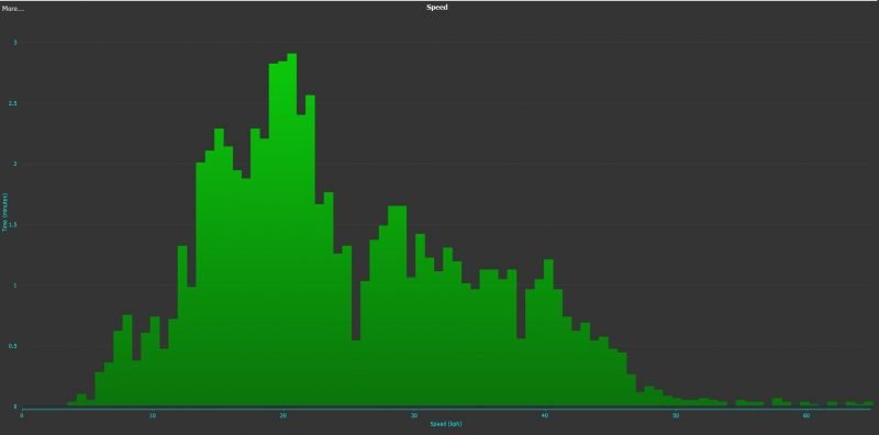
Activities > Speed
Chart View Options: Bin Width, Shade Zones, Show in Zones
Shows your Speed during the activity.
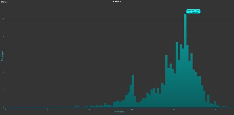
Activities > Cadence
Chart View Options: Bin Width, Shade Zones, Show in Zones
Shows your Cadence during the activity.

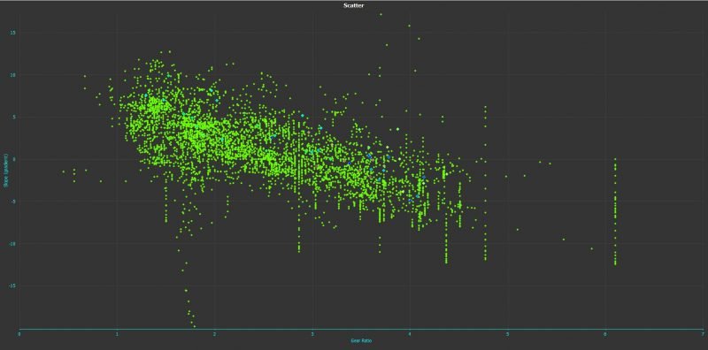
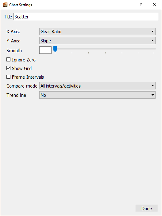
Activities > Scatter
Chart View Options: X Axis metric choices dropdown, Y axis metric choices dropdown.
The Scatter chart (also called a 2D chart) displays the activity data as a collection of points, each having the value of data series determining the position on the X-Axis and the value of the other data series determining the position on the Y-Axis.
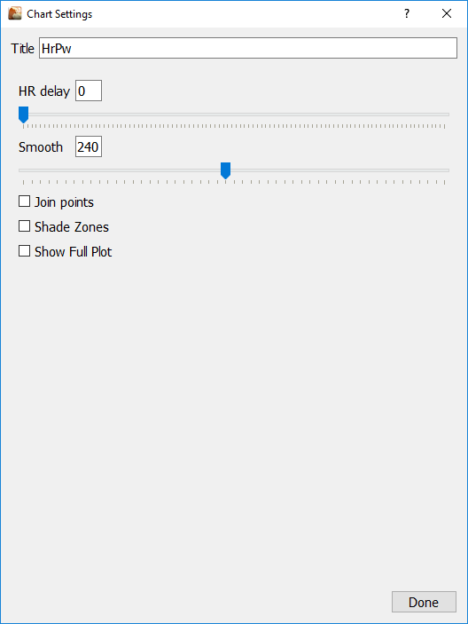
Activities > HR/PW
Chart View Options: HR Delay/Smooth
This chart shows the distribution of HR and the distribution of power for the whole activity (on X-Axis (Power) / on Y-Axis (Heart Rate) - along with the HR/Power data points during the activity.
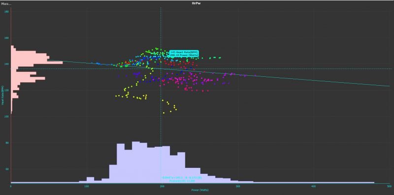
HR vs Power
The distribution of HR and Power is shown proportional, but not with a specific scale. The mouse-over information on the bars is only relevant for the dimension (Power or Heart rate) of the axis. The seconds’ value has no relevance.
The set of colored points / the colored line in the center of the chart shows the development of the Power/Heart rate relationship over the time of the activity.
The determination approach and the relation to the chart parameters is outlined here:
Power/Heart rate data points for the plot are as follows:
Smooth the activity data points (every second) are first "smoothed" by calculating the moving average value over the time period (in seconds) defined in this parameter
Only data points where the heart rate is above 50 and power is between 50 and 500 watts are further considered
HR Delay shifts the heart rate by the given value (in seconds) - that means for a data point recorded at second in the rade "X" the heart rate from second 'X+HR Delay" is assigned
To reduce the number of data points shown on the plot, only every 10th point is plotted
Other chart parameters are:
Join Points - if checked, instead of single data points they are plotted as a complete line
Shade Zones - if checked, adds the power zone shading
Show Full Plot - if checked, also the activity (power and heart rate curves only) are shown at the bottom of the view
The coloring of the power/heart rate plot (along the activity time) follows a special logic. The available data points are segmented into 36 subsequent groups. Each group is assigned a separate color, which is determined from an HSV color code. The HSV coloring covers all colors in a "circle style". Each segment of the activity data points segment is plotted in a color of the circle (see HSV colors) - starting at 'Yellow' and moving by an angle of 10 degrees (direction see 'Arrow') to determine the color for each new segment.
HR vs Power Colors
The Power@150 value is estimation of your PWC150 value based on activity data. PWC150 (Physical Work Capacity at HR 150) is a measure in diagnostics - it follows a tiered test protocol but ends with the HR of its name (here 150). For further details, please use the search engine of your choice with the given key words.
https://github.com/Golden Cheetah/Golden Cheetah/wiki/UG_ChartTypes_Activities#heartrate-vs-power
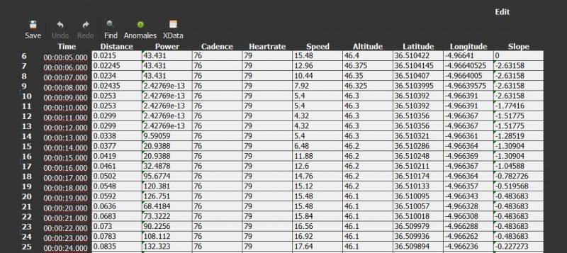
Activities > Edit
Lets you manually change values in the underlying data. Use with care!
Golden Cheetah Activities chart types
Here’s a detailed description of Golden Cheetah activities chart types

